
Improving Web Experience
Streamlining design components and simplifying naming conventions boosted consistency, reduced maintenance complexity, and enabled faster, scalable development for long-term success

Ooohh, shoot...mess, just a mess is what this was. How does this even work? I asked myself. How in the world is this functional? But for some reason it worked, and I needed to make it work better and be more organised. So did an audit, of they design system, pin-pointed the main issues, did a presentation explaining what cna we do, client saaid..”ok”...and we started our way of improving and making this mess be a scalable mess. We reduced amount of components, simplified the structure and improved it so becomes easier to maintain. Set up a governance process with ux and dev team so they don’t continue adding components there like it was a trash can... Was it successful?..mmmm..here and there...it was not bad, we gave our best with what we had and that is the most important thing! 😥
Intro
Imagine a financial giant that's been the backbone of the UAE since 1976. This isn't just any bank - it's an institution that helped shape the nation's financial landscape from the very beginning. With decades of trust and millions of satisfied customers, they've been the go-to name for everything from personal banking to major financial services.
But even the most established players need to keep up with the times. Despite their rock-solid reputation and deep roots in the community, they faced a modern challenge: their design system needed a fresh perspective. It was like having a luxury car with all the right parts, but needing a mechanic to fine-tune the engine for peak performance.
You run and you run to catch up with the sun, but it's sinking...
From Racing to Pacing
Picture a team caught in a whirlwind - UX designers racing to meet client demands while UI developers scrambled to keep up. Like a game of digital hot potato, designs were being tossed back and forth so quickly that their design system started showing cracks. Sure, they were getting things done, but at what cost? Sometimes you need to pump the brakes to go faster later - that's exactly what we did. In a world of "we need it yesterday" deadlines, we made the bold choice to slow down, take stock, and build a foundation that would actually help them speed up in the long run.
And at once, I knew I was not magnificent...
Audit & Action Plan
We needed a clear picture before making any moves. Our quick but thorough audit revealed four key issues: inconsistent designs, messy naming conventions, duplicate components, and responsive design problems. With this diagnosis in hand, we mapped out a strategic roadmap, prioritizing the most urgent fixes while keeping the team's tight timeline in mind. It wasn't about fixing everything at once, but about tackling the right problems in the right order.

Turn and face the strange...
Design Inconsistency
When a design system loses consistency, it triggers a chain reaction. Users struggle to navigate interfaces they should trust, leading to hesitation and confusion with every interaction. For the development team, this inconsistency means slower delivery times as they wrestle with multiple versions of the same components.Our solution was twofold: First, we developed clear, comprehensive design guidelines that set firm standards for the system's look and feel. Second, we created a pattern library of reusable UI components and layouts. This standardized toolkit streamlined work for both designers and developers, making the system more efficient and reliable.Simplifying Component RedundancyOur system had three components doing similar jobs with different looks. Instead of maintaining multiple versions, we consolidated each into a single, strong design. This approach not only simplified maintenance but gave teams clear guidelines on which component to use and when.

Naming Convention Too Specific
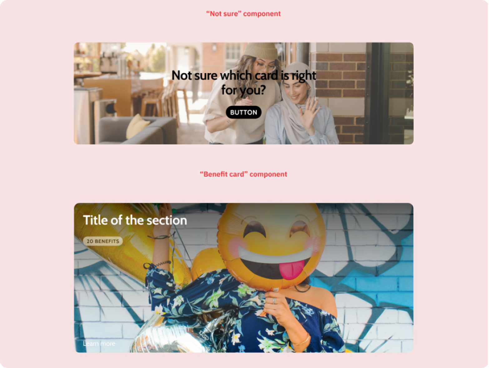
Over-specific component names like "FormButton" or "NavigationButton" were creating three major problems: limited reusability across contexts, difficult scaling when adding new components, and complex maintenance of the codebase.Our solution was to implement a universal naming system. This made components more flexible, easier to scale, and simpler to maintain, while strengthening our overall design language consistency.ConsolidationLooking at our "Not sure" and "Benefit card" components, we spotted an opportunity for simplification. Despite their different content, they share the same basic structure - an image with overlaid text and a call-to-action. Instead of maintaining two separate components, we unified them into a single "Banner" component with variants. This approach made our system cleaner and more efficient.
Redundant Components
Duplicate components were causing three key issues:
- Team confusion over component selection
- Difficult maintenance across multiple versions
- And a complex, hard-to-manage codebase.
Our solution was straightforward: consolidate redundant components into single, versatile versions with clear variants. This not only simplified maintenance and scaling but also made component selection more intuitive for the team..
One card many uses
The image shows a perfect example of component streamlining. What looks like different components - promotional cards, account selection cards, and credit card offers - actually share the same basic structure: an image or color background, title, description, and CTA button.Instead of maintaining these as separate components, we unified them into a single "Card" component with variants. Each variant maintains its unique styling while sharing the same core structure, making our system more efficient and consistent.This practical example shows how smart consolidation can simplify a design system without losing functionality.

Component Sizes Hard to Maintain
Maintaining separate components for mobile and desktop created unnecessary complexity and inconsistency. Our solution was simple: merge them into single, responsive components. This not only made our design more consistent across devices but also improved code efficiency and maintenance. Better yet, it ensured a unified user experience regardless of screen size.

Component Documentation
Figma's properties panel became our built-in documentation hub. By adding component descriptions directly within the panel, we ensured that essential information stayed with each component, making it instantly accessible to anyone using it.

It's just a reflection of a reflection of a reflection...
Component Structure

One Truth, Many Uses
Static values like hex codes became dynamic, purpose-driven tokens. These tokens act as a shared language between design and code, defining not just what each element looks like, but where and how to use it. With this system, updating a single token automatically refreshes every instance across the product, keeping our design consistent and maintenance efficient.

And the Walls Came Tumbling Down...
The streamlined design system led to improved consistency, reducing confusion and speeding up development.
Slowing down to fix foundational issues enabled faster, long-term gains.