Design System Transition
This financial institution successfully transitioned to Figma, developed a new design system, and empowered its team to collaborate effectively, resulting in increased efficiency

No data here, no numbers, it’s not a standard case study. Client wanted to move from Sketch to Figma. They didn’t know why, they just saw it as logical step. Buut, no worries, I get hired to help their team make transition and set up functional designs system. Their senior designer, great dude, really dedicated to the craft, knew the whole platform in an out, so he did an audit. From there we knew what we need and how we want to set up the structure. We crated the base with all the design tokens. From there incrementally started to build new design and re-build old ones. Design system needed to support several designers from the team so we made sure to have clear governance in place. When everything was set up and running, I said bye bye, because that’s why I was there and my job was finished
Intro
In mid-2022, a leading financial institution faced a familiar challenge in the fast-paced digital world. With customer expectations on the rise, they recognized the need for a comprehensive design update to stay competitive in the fintech landscape. This institution, which we'll keep unnamed, took on an ambitious project to refresh their entire design approach. They decided to transition from Sketch to Figma while also developing a new, cutting-edge design system. It was a big step, but one they were ready to take.
And the Walls Came Tumbling Down...
Embracing Team Momentum
What made their approach stand out was the collaborative spirit they brought to the process. Instead of traditional training methods, they encouraged a hands-on, team-oriented approach to building the new system. This not only helped everyone get comfortable with Figma more quickly, but it also created a strong sense of ownership among the team members.By working together in this way, the institution found that they could adapt more quickly to the new tools and processes. The team's engagement with the project ensured that the new design system wasn't just a set of rules, but a shared vision for the future of their digital products.
And the Pieces Fall Into Place...
Blueprint of Change
The initial phase began with a careful examination of existing design assets to understand what worked and what needed improvement. This assessment led to the creation of fundamental elements - from color palettes to typography and spacing principles.With the foundation in place, the team moved forward to create a robust set of design tokens. These weren't just arbitrary decisions; each token was carefully structured to bring clarity and consistency to the work. The establishment of clear component guidelines made the system both powerful and accessible for everyone involved.

Architecture of Order
Since the institution needed to move faster towards design system adoption, the goal was to enable them component usage based on the requirements they had. For example, they were working on a wizard set up which involved a lot of inputs and buttons etc...accordingly, we decided to set up and publish components based on their need.

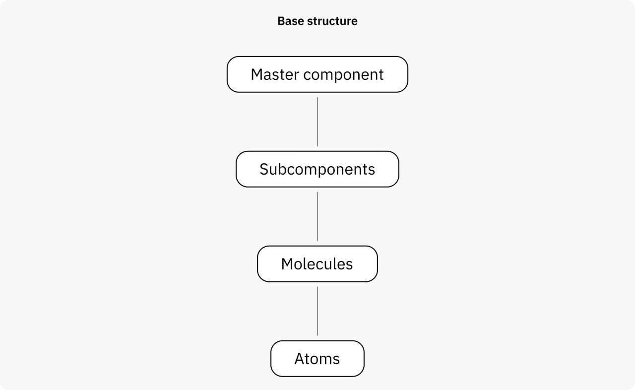
Component structure
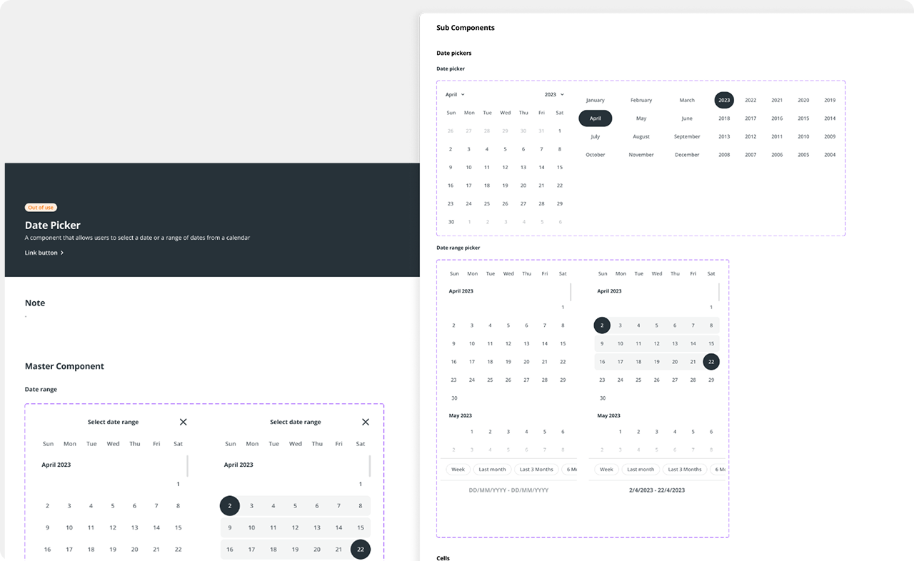
The team adopted an atomic structure for component development, starting with subcomponents as the foundation and combining them to form primary components. This approach ensured straightforward maintenance and business scalability. Breaking everything down into smaller parts provided greater control and accelerated overall maintenance processes.

And the Pieces Fall Into Place...
Documenting design decisions
A comprehensive set of documentation was created to ensure alignment across teams. Design decisions were supported and explained, while rules and guides were established for all design system users. Each component was defined through:
- Overview
- Variations
- States
- Anatomy
- Properties

A Symphony of Progress
The project resulted in the creation of a set of design tokens, component guidelines, and an atomic structure for component development, enhancing maintenance and scalability.
A team-oriented approach to training was effective. Examination of existing assets was crucial. The project emphasized the importance of structuring design tokens. Component usage should be based on specific project needs. The adoption of an atomic structure for component development enhanced maintenance and scalability. Comprehensive documentation was essential for ensuring alignment across teams.